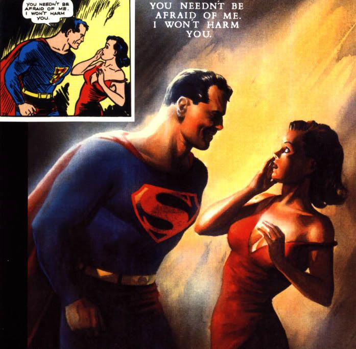
Designs change over time. Even the most iconic designs have room for revision, if only in small ways. This image features a classic Superman panel from the 1930s, juxtaposed with the revised and updated version by Alex Ross. The scene is Superman's first meeting with Lois Lane, reporter.
Medium makes a tremendous difference. While the original artists were limited by the medium of print and cheap comicbook paper, Alex Ross worked in paint with few such limitations. The result is nothing short of stunning, the figures becoming much more lifelike and detailed. There's something about the stylistic touches and the haze-like quality that almost reminds one of an old movie poster. It has a certain timelessness, like much of his work.
On the topic of words chosen to accompany an image, in both versions the words seem odd considering the Man from Krypton's posture. He fairly towers over Ms. Lane, and it's obvious why she would need reassurance. The newer painting makes this even more clear. He appears almost menacing, a far cry from the images usually associated with the character. The curve of the two characters combined with the lighting draws the eye toward the right, where we are met by the shocked - or fearful - expression on Lois' face. What manner of man is this?
Ross's modernization of the S-shield is prominantly displayed as well, providing another personal stamp on the revised image. Alex Ross favored the version of the shield featured in the Superman cartoons, using negative space rendered in black rather than the more common and friendly yellow.
It's interesting to take a look back and see how designs change, and what a later eye and hand will do to render the same scene.
No comments:
Post a Comment