 |
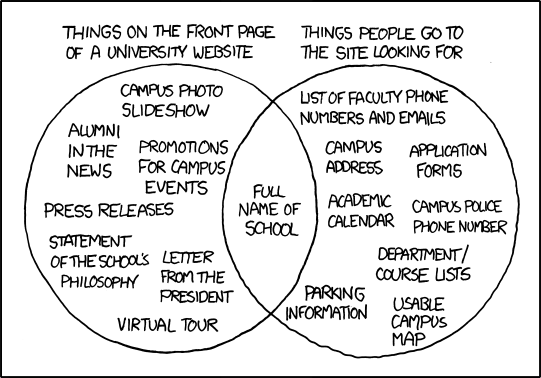
| Something is wrong with this picture... |
The average website does its utmost to inform. And that's good; people want information. It's usually why we go looking for websites. What isn't good is getting all of it at once, and not knowing where to find the information we actually came looking for. Referring to the
XKCD strip above, I have yet to find a university website that actually makes finding what you're looking for intuitive without bombarding the user with information that they probably aren't there to find in the first place. Worse, a lot of them fail to follow a logical grid, which makes them a bit more of a strain on the eyes. It's almost as if they didn't allow an actual designer to do the work of designing them a web site ...
 |
A sample of the kind of thing that littered
the walls of my place of work. |
A similar phenomenon takes place in the real world quite often. For example, at my last job working in the Learning Center at my community college, there were a lot of signs. And I mean a lot; the walls were almost covered with them, all competing for the attention of students who barely had time to look at one sign, let alone so many. Signs to let them know that Twitter was banned, Facebook was right out, no shopping, no drinks on the desks, the printers are in the back, instructions for logging in, and so on.
The number one question I got in my time there was, "where are the printers?" My desk was located almost directly in front of a sign which pointed in the direction of the printers, and further to the left of it were windows through which the printers could be seen. The information overload effect was at work; habituated to the signs, the students asked a real person instead of reading; indeed, instead of bothering to look for themselves.
What does this have to do with design? Everything.
People don't want all of the information at once.
They want to feel welcomed. They want it to be clear how to
get the information they're looking for easily, and they want manageable chunks of information. You don't eat ice cream all at once; you eat it one bite at a time. Information is the same.
In the lab setting, I'm not certain what the best solution is; but signs are rarely the right approach, because no one wants to read them - especially when they appear severe and full of "don't." Perhaps a friendly sign that welcomes them to the lab; another further in suggesting that if they have problems with anything, they can ask the friendly person at the help desk . . . and then, taking a cue from Apple, instructional signs in key places - or alternatively, instructional videos on the desktop. Block the social sites if they have to be blocked, but blocking combined with all the signs is a bit much.
As for the school websites, reducing the clutter on the main page would be a good place to start, along with strengthening the grid and improving navigation to make finding exactly what the user is looking for as simple as possible. Elegant; aesthetic; easy. Usability is key.
Whether in life or on the web; please, keep the noise to a minimum.
 |
| Yeah... it's kind of like that. |
Not all school websites are created equal, but almost all could stand a second look.

No comments:
Post a Comment