Monday, November 29, 2010

Design is Dangerous: 1971 Ford Pinto

The Ford Pinto made Time Magazine's list of the 50 Worst Cars of All Time. Not for the normal reasons people dislike a car; oddly, not because it was an especially bad car.

See, the Ford Pinto was best known for having a particularly volatile gas tank. It had a tendency to burst into flames when rear-ended. Now, this sounds like a rather severe design flaw - the gas tank was located in the rear of the car, and wasn't sufficiently protected from impact. 

Unfortunately, it gets worse. Lawsuits in 1977 alleged that Ford was aware of the design flaw, and released the car to the public without correcting it on the grounds that it was more cost effective. The infamous Ford Pinto Memo contained a Cost-Benefit Analysis in which someone - ostensibly Ford - weighed the cost of repairs against the monetary value of a human life, and decided it would be cheaper to pay for possible lawsuits arising from deaths. 

It was later revealed that the memo in question may not have actually originated from within the Ford Motor Company, and that the location of the gas tank - behind the axle - was actually fairly common for the day. The 27 deaths which evidently occurred out of some 2 million vehicles built were not actually significantly higher than the norm. So, was Ford responsible, or not?

The truth is murky, but there are still lessons to be learned. 

If Ford was aware that the design of the Pinto posed a significant risk to the public and chose not to correct the flaw, they clearly needed an ethics adjustment. The government should not pass laws they are not willing to be subject to; the designer should not, in good conscience, release to the public something that she would not personally use.

Is this ethical? Is it safe? Is it usable? Does it solve the problem at hand? These are all questions a designer should be asking, along with the more esoteric concerns. Is it beautiful? Is it simple? Is it cost effective?

The designer must ask; would I want to be remembered for this?

I'm looking at you, Ford.

Design in Society: Utopian Design

A design is Utopian if it purposely aims to improve society.

Some of the best examples of this can be found on the website for the James Dyson Award, targeting the field of engineering design. The terms of entry are simple for qualifying participants: design something that solves a problem. And really, that's what practical design is about. Solving problems.

This year's winner is a project dubbed Longreach. Longreach is a portable device designed for rapid deployment of emergency buoyancy devices - Life Preservers - which are composed of a highly compressed foam compound that's activated by water. When the capsules hit the water, they expand almost instantly to form a fully useful floatation device. These floatation devices are supposed to keep the drowning victim alive until emergency personnel can prepare an appropriate response. 


Every year, hundreds of people drown while rescue personnel are present, unable to get to them in time. Longreach could solve that problem. The expanding foam floatation rings are relatively cheap to manufacture. As such, Longreach could be put into use in a wide array of circumstances, replacing the conventional life ring with something capable of launching a rescue tool much further and quicker than the human arm can throw it. It's currently in the prototyping and testing phase, but it shows a lot of promise. 

Color Transforms:

Color transforms what it touches. 

Take the Starbucks logo. The classic logo, and the temporary “retro” logo, are brown; the iconic logo that everyone recognizes now, the iconic logo, is green. Each evokes different responses. Green is generally perceived as a friendly color, making one think of spring, or renewal - or the word, "go." It stands out, vividly, attracting attention and keeping it. 

Brown, admittedly, is the color of coffee – but it’s a much more bland, understated color. Professional, maybe – a color associated with business. It speaks of a more reserved sensibility, appealing most to the older generation who might remember the original logo. It can suggest a certain different kind of warmth, but time will tell if it is effective here.

Would Superman’s costume be as effective in a different color scheme? Cut any of the component primary colors, and it loses much of what makes it bold and powerful. Without the yellow backdrop to the iconic shield, he’s almost sinister; without the red trunks, the blue becomes overwhelming and almost melancholy, off center and unbalanced.

The Starbucks logo, in green, is similarly bold. It’s simple, yet effective, and it demonstrates the difference a choice of colors can make very easily. It's a subjective judgement, but I think it has the "Superman" quality - that certain "it" that a design needs in order to take off on its own power. Josef Albers would argue that color is always subjective, and there's a good deal of truth in that.

Of course, if the logo didn't have "it," would there be a Starbucks in every airport in America? Would there be a Starbucks in London charging five pounds for a cup of coffee just up the street from a local shop charging one?

Probably not.

Monday, November 15, 2010

Facebook "Mail": Design Folly?

For those who haven't been paying attention recently, Facebook has just unveiled its new social email system. Intended to integrate chat, SMS, email, and Facebook messages into one single conversation between you and the person you converse with, it's designed as an alternative to email for people who don't use email. 

Loosely translated, if you're anyone but a high school student and Facebook addict, it's probably not for you. If you're used to having conversations thread by topic and not just by person, it's probably not for you. 

Facebook designed their 'email' solution after talking to high school students who indicated that they didn't use email, on the grounds that it was "too slow."

I find this entertaining, because I've always felt that email was often too fast. So often, it lacks social graces; people write emails while ignoring the polite niceties established in letter writing ages before it. So much about modern technology is all about distraction, and very little of it is even as polite as a conversation in person. 

I've tried to correct this problem in my personal correspondence, which I suspect will one day mark me as a social dinosaur.

The question is, then: is Facebook's solution good design? Or is it an indicator of what's happening to society as a whole? I tend to lean towards the latter. To me, it looks cluttered, unpleasant, and noisy; impossible to keep more than a single topic moving at a time. It can't do what email can do already, and it lacks elegance, simplicity, or much in the way of aesthetic appeal.

Perhaps it will be useful for some. Perhaps it will meet the needs of the group it was designed for, but it's obviously not meant for people like me.

Sunday, November 14, 2010

Ergonomic Design Criticism: The Laptop

A typical laptop by Acer.
We are now in the age of the mobile computer. 

More and more, laptops and other mobile solutions are replacing the desktop in the workflow of the majority of the world, from students to business use to teachers in school. The ergonomics of the desktop have been well considered, but ergonomic concerns are often discarded when devising solutions for mobility. 

Is that wise? Let's consider the issues for a moment. When dealing with ergonomic concerns, there are five areas to consider: Safety, Comfort, Ease of Use, Performance/Productivity, and Aesthetics. Let's see how a few of the popular mobile devices right now address - or fail to address - these concerns. 

1. Safety

This concern, admittedly, is fairly well addressed. Despite the scare a few years ago about exploding laptop batteries, generally using a mobile device is safe unless you foolishly immerse it in water. Assuming everything is originally in working order. There are some unproven concerns about radiation in cell phones, but a more obvious safety concern exists for men using laptops for their theoretical purpose, i.e., on ones lap. Heat from the discharge fan can lead to infertility in men - not to mention painful burning. Using devices such as a smartphone or tablet device, e.g. the iPad, is one way of addressing this concern. If one is stuck using a laptop, however, the best solution is most likely to keep it off of ones lap, which is something of a painful irony, or of obtaining a lap-desk. Both options have their own issues, which leads me to my next point.

2. Comfort

There are several problems with comfort surrounding laptop use in particular, most of them only arising through long-term use. However, with the new emphasis for many of a mobile device as a sole computing solution, these problems will come up more and more.

One of them is finding a comfortable way to use the thing long term that minimizes strain on various joints. It turns out there IS one way to do it correctly, but it's not always practical. Using it on a desk is often a problem; the screen falls below eye-height, and raising it up to eye-height would require a stand of some kind and possibly an external keyboard. 

Speaking of the keyboard, the keyboard of a typical laptop is cramped - and that's the best case scenario. Using one long term can lead to carpal tunnel syndrome, another reason why they were never intended to replace the desktop computer (with the availability of ergonomically friendly keyboards). The mouse is often even worse; a tiny little pad through which to interact with the contents of a large screen. I speak from the place of most students; a primary laptop user who doesn't really have the funding or space for a desktop.

Smaller devices bring their own problems; when the iPad first came out there was a great deal of discussion among tech blogs about how you were supposed to hold one, and the tiny keyboards of a BlackBerry or the touch keyboard of the iPhone or various Android devices wouldn't be better for long term typing. For short emails or text messaging, however, the problems are minimal.

3. Ease of Use

I would argue that most mobile devices do a good job of meeting this criteria. Microsoft's Windows 7 OS has come leaps and bounds over any previous version of the operating system, and Apple has made ease of use their main goal over the last several years with both OS X (for desktops and laptops) and their iOS mobile platform for the iPad, iPhone, and iPod Touch. Microsoft has also recently launched their own smartphone platform, Windows Phone 7.
 
Linux is also making great strides forward in this department, but it still lags significantly behind, particularly given incompatibilities with certain hardware. Android, the mobile variation powered by Google, is also supposed to be fairly user friendly, though from my limited experience with the platform I have found iOS to be a bit friendlier. 

But my primary focus is still the laptop, and as such the laptop is no less friendly than a desktop with a similar OS, assuming that one has no problems navigating the smaller keyboard or mouse.

4. Performance/Productivity

The typical mobile device is very useful, and very productive. Having something easily at hand at all times to allow one to send and respond to urgent emails, write papers for class or work on designs immediately as they occur to you is definitely useful, and this is one of the tradeoffs of the mobile platform; because of the need for portability, some of the lower levels are sacrificed to allow for productivity on the go.

This argument - that mobile devices are productive - quickly goes to pieces when one glances through the iOS AppStore and sees the sheer number of apps that do nothing more than play farting noises, but despite this, it's still a useful platform. Laptops, smartphones, and other mobile devices fill a gap that isn't quite covered by the traditional notepad.

In terms of the smartphone, there is a perception that the BlackBerry is more "business" friendly. Perhaps that's true, but the tiny keyboard and ridiculous little mouse pointer don't really speak to the ergonomics of the platform; it's the worst elements of using a laptop compounded and exaggerated, then combined with the best elements of a phone.

5. Aesthetics

There are very few mobile devices that are truly ugly; in terms of software, Windows 7/Windows Phone 7 and OS X/iOS are all extremely appealing on a visual level. Android, in my perception, lags here, as does Linux - both seem to rely heavily on the end user to make up for the shortcomings of their design team, though this is more true of Linux as a whole than Android.

As far as hardware is concerned, it must be said; no-one does aesthetics like Apple. Apple understands aesthetics. Whether aesthetics are enough to overcome any other inherent shortcomings of the mobile platform is another question.

Either way, mobile devices are here to stay. Let's hope our wrists can handle the strain long enough to applaud.

Monday, November 8, 2010

Word and Image part 3: Superman Revisited

Designs change over time. Even the most iconic designs have room for revision, if only in small ways. This image features a classic Superman panel from the 1930s, juxtaposed with the revised and updated version by Alex Ross. The scene is Superman's first meeting with Lois Lane, reporter.

Medium makes a tremendous difference. While the original artists were limited by the medium of print and cheap comicbook paper, Alex Ross worked in paint with few such limitations. The result is nothing short of stunning, the figures becoming much more lifelike and detailed. There's something about the stylistic touches and the haze-like quality that almost reminds one of an old movie poster. It has a certain timelessness, like much of his work.

On the topic of words chosen to accompany an image, in both versions the words seem odd considering the Man from Krypton's posture. He fairly towers over Ms. Lane, and it's obvious why she would need reassurance. The newer painting makes this even more clear. He appears almost menacing, a far cry from the images usually associated with the character. The curve of the two characters combined with the lighting draws the eye toward the right, where we are met by the shocked - or fearful - expression on Lois' face. What manner of man is this?

Ross's modernization of the S-shield is prominantly displayed as well, providing another personal stamp on the revised image. Alex Ross favored the version of the shield featured in the Superman cartoons, using negative space rendered in black rather than the more common and friendly yellow.

It's interesting to take a look back and see how designs change, and what a later eye and hand will do to render the same scene.

Word and Image: Part 2 - "By your powers combined. . . "

Comics are a unique medium. Nothing else features words and images combined in quite the same way as in comics, each reinforcing the other. Little else comes close to the power of the comic's iconography. In the space between word and image, magic happens. 

Part of that comes down to the old rule among writers, 'show, don't tell' - except in comics, this is much more vivid. Showing is, after all, what the pictures are for. 

I chose this set of panels from All Star Superman, drawn by Frank Quitely and scripted by Grant Morrison, because they capture a lot of things perfectly. They show the essence of Superman; and they show the essence of good design. 

In this case, by showing us what the words cannot tell us, and using the minimum number of words to move the scene forward. Four sentences, five panels. 

The result is far more than the sum of its parts.

This kind of scene is tremendously hard to capture in word or image alone, but here we see the human side of a character who spends so much time flying above his city, looking down from above like a modern day god - but still has the time to step in and change the course of a life. A man who knows the right words to say, and thanks to Grant Morrison, when to be silent.

Sunday, November 7, 2010

Word & Image Part 1: Interactivity in Design

Comics are defined by McCloud as juxtaposed pictorial images arranged in deliberate sequence; though words are not required by his definition, they are an essential part of the media. While a comic book cover lacks juxtaposition, it often contains words and images working together to intrigue, entice, and sell. Comics have a lot of competition - a good cover can mean the difference between having your book picked up and read, and having it sit on the shelf ignored while the children go read something more appealing, like Superman or Spider-man.

In Brian Fies' guest lecture in Design 1 last week, he spoke to this very issue, describing comics as being words and images combined together in a way that transcends both. Each works together, and the message is incomplete without either element. Further, contrast becomes possible, as we can be shown one image and have it described very differently; the image of men robbing a jewelry store, while the narrator describes his foray into "high finance," for example.

The image above was chosen for one reason; by every decent definition available, it does a terrible job of balancing this out. The words repeat the message of the picture, muddling the whole of the issue - rather than reinforcing anything, it merely leaves us with the notion that the characters shown are somewhat dense. Why don't they just move aside, rather than stand there and describe the tower in vivid detail as it falls toward them? The plain purple jumpsuits do little to defeat this idea; even ordinary clothing would be more visually engaging, but as this is a space comic, ordinary clothes are out of the question. Apparently jumpsuits are space-age? The word bubble is the most laughable part of the piece, though to be fair, it was the silver age. Characters were known for being able to make absurdly long speeches in ridiculously little time.

Images can be worth a thousand words; a few words added in can make them more powerful. In the next part of this series I'll be taking a look at an image that does this right. Stay tuned.

Monday, November 1, 2010

Information Overload

Something is wrong with this picture...
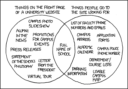
The average website does its utmost to inform. And that's good; people want information. It's usually why we go looking for websites. What isn't good is getting all of it at once, and not knowing where to find the information we actually came looking for. Referring to the XKCD strip above, I have yet to find a university website that actually makes finding what you're looking for intuitive without bombarding the user with information that they probably aren't there to find in the first place. Worse, a lot of them fail to follow a logical grid, which makes them a bit more of a strain on the eyes. It's almost as if they didn't allow an actual designer to do the work of designing them a web site ...


A sample of the kind of thing that littered
the walls of my place of work.
A similar phenomenon takes place in the real world quite often. For example, at my last job working in the Learning Center at my community college, there were a lot of signs. And I mean a lot; the walls were almost covered with them, all competing for the attention of students who barely had time to look at one sign, let alone so many. Signs to let them know that Twitter was banned, Facebook was right out, no shopping, no drinks on the desks, the printers are in the back, instructions for logging in, and so on.

The number one question I got in my time there was, "where are the printers?" My desk was located almost directly in front of a sign which pointed in the direction of the printers, and further to the left of it were windows through which the printers could be seen. The information overload effect was at work; habituated to the signs, the students asked a real person instead of reading; indeed, instead of bothering to look for themselves.

What does this have to do with design? Everything.

People don't want all of the information at once.

They want to feel welcomed. They want it to be clear how to get the information they're looking for easily, and they want manageable chunks of information. You don't eat ice cream all at once; you eat it one bite at a time. Information is the same. 

In the lab setting, I'm not certain what the best solution is; but signs are rarely the right approach, because no one wants to read them - especially when they appear severe and full of "don't." Perhaps a friendly sign that welcomes them to the lab; another further in suggesting that if they have problems with anything, they can ask the friendly person at the help desk . . . and then, taking a cue from Apple, instructional signs in key places - or alternatively, instructional videos on the desktop. Block the social sites if they have to be blocked, but blocking combined with all the signs is a bit much.

As for the school websites, reducing the clutter on the main page would be a good place to start, along with strengthening the grid and improving navigation to make finding exactly what the user is looking for as simple as possible. Elegant; aesthetic; easy. Usability is key.

Whether in life or on the web; please, keep the noise to a minimum.
Yeah... it's kind of like that.
Not all school websites are created equal, but almost all could stand a second look.

Industral Design Critique: Apple iPod Touch

The iPod Touch is a beautiful piece of good design at work. The 4th Generation version of the product is pictured to the left; the image is borrowed from Apple's website. The overall direction of the device's shape and feel is usually credited to Steve Jobs, most likely with the assistance of Jonathan Ive, the Director of Apple's Industrial Design Group, and a larger team of other designers.

I'm not going to discuss specifications, the AppStore, or anything along those lines. What I'm going to discuss is how the design works.

The elements to consider are Form and Content. Content, in this case, refers to the core element of the device, which is either a mp3 player, or it's a netbook with a built in camera that also plays mp3's - depending on who you ask.

First, harkening back to Objectified, the iPod Touch is built in a way that everything about the device defers to the display. Apart from two buttons and a volume control, the capacitive touch screen is the primary means of interacting with the device, and it takes up as much of the surface area of the product as is reasonable. Internally, it has to contain a Wi-fi antenna, and the new generation also incorporates two cameras, one forward facing, and one at the rear of the device. The front camera is barely noticeable as an opening in the case, while the rear camera is a slightly more visible lens. Each is minimal in size, attracting little attention when not in use. This fits with the philosophy of the device; the screen is everything. To paraphrase Jonathan Ive, a camera is only of value when it's photographing something; the rest of the time, it should be out of the way.

The form of the device is bilaterally symmetrical, but for the presence of the nearly invisible volume control on one side and the camera lens on the back. The polished appearance of the back is smooth to the touch and visually interesting, giving it a sleek look, and the combined black and silver color scheme common to Apple's current product line makes it feel very modern.

iOS in action on the iPhone 4
iOS, the operating system used by Apple's mobile device line, is another element of the good design of this product. Steve Jobs is very fond of using the word, "magical," to describe various Apple products. In as much as certain activities are very easy to do in a very intuitive way, if one invokes Clarke's Third Law, it isn't far off. Of course, I prefer Gehm's Corollary; "Any technology distinguishable from magic is insufficiently advanced." Technology isn't there yet, but it's getting closer.

I personally own the previous model of iPod Touch, and have come to admire the entire line from a technology standpoint, but even more so from the standpoint of good design. The first time I saw one in person, I knew there was something different about it, but I couldn't put it in words. Now I can.

As an additional point of interest, Apple's product line is billed as environmentally friendly. For more information, follow the link.

For additional information about the history of design at Apple, click here, as well as additional information about why Apple design works, and more design tips gleaned from Apple.