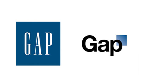
| Gap's original logo, left, and the recently aborted planned change, right. |
A good logo says something about what it represents; it catches the eye, establishes a brand, and calls up associations in the mind of the viewer - hopefully positive ones. Over time, these associations become even more embedded in a consumer's mind, locked into place by experience.
Changing a logo can be a good thing. It can capture the attention of new customers, and give a company a 'fresh' image. On the other hand, it can destroy brand integrity, offend an existing customer base, and occasionally make the company look bad. In recent times, Gap considered a logo change and made public their planned replacement logo, which was instantly shot down amid a veritable storm of derision. Let's compare the design of the classic Gap logo with the new one, and see what makes them effective - or ineffective.
The original logo makes good use of shape and symmetry; the text, rendered in simple, high-impact capital letters in a cutaway style, is sharp, and stands out from the elegant simplicity of the background. In all seriousness, it's a square. It doesn't get much more basic than that, and yet, it works. Sometimes the simplest design is the best one, because simplicity is strangely beautiful. The blue and white color scheme is warm and inviting. It's attractive, yet functional.
 |
| What we all ask when we look at this logo. |
Logos are a delicate issue; when designed well, they can last a long time, and create positive associations, marking those who use them as enduring, and demonstrating their strengths. Done badly, they can ruin you, and a poor redesign can ruin brand integrity.
No comments:
Post a Comment