Sunday, October 31, 2010

Form and Content in Objectified

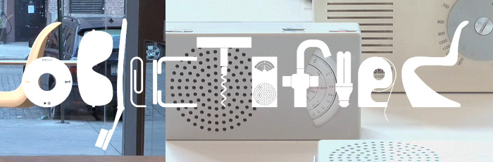
Last Thursday in Design 001, we spent most of the class period watching the excellent documentary film Objectified, logo at the left, with the purpose of discussing form and content. Objectified is an exploration of the many everyday objects we see, touch, and use all the time, but rarely stop to think about - and, by extension, an exploration of the people who make them.

There are two elements at work, here; the form and content of the film itself, and the ideas about form and content and how they should interact discussed by many of the designers interviewed; both intersect in two key ideas, expressed again and again throughout the film. Summarized, they are as follows:

Design is the quest for form.
Form should be determined by content.

The form of the film is structured around the close-ups. Shots focused in on the objects we might otherwise have ignored in favor of looking at the people who hold them or use them are emphasized heavily. The form - the style and methods of the work - is determined by its content - the main idea, the core of a work. In this case, that core is the everyday objects - the designed. 

For me, the part of the film that makes this clearest are the interviews with Dieter Rams, former Design Director at Braun Kronberg, and Jonathan Ive, VP of Industrial Design at Apple.

A sample of Rams work, the Universal Shelving System.
Rams, in his interview, described his 10 commandments of design, reproduced here to ensure that I never misplace them.
Good design ...
... should be innovative
... should make a product useful
... is aesthetic design
... will make a product understandable
... is honest
... is unobtrusive
... is long-lived
... is consistent in every detail
... is environmentally friendly
... is as little design as possible
Rams went on to explain that the only company he felt was operating according to his principles was Apple. And he has an excellent point; is there anyone else in the computing world who knows better than Apple that the form of a thing should be determined by the content, the core, of the thing itself? Almost nothing about the Apple line appears arbitrary or forced; everything is calculated to, as Jonathan Ive put it, get the design out of the way. The results are nothing short of beautiful. Gentle curves and sleek lines give a feeling of symmetry, the aluminum case is both durable and aesthetically pleasing, and the construction process economizes that aluminum to minimize waste.

Let me be clear about something; I'm a PC, I know my way around Windows. But I appreciate good design at work, and that, more than anything else, is what Apple has over every one of its competitors.

The message of Objectified seems to be that form should be derived from the function of an object; that design is the process of finding the form best suited to content.

Monday, October 18, 2010

Simplicity

Simplicity matters.

This becomes clear very quickly in the varied world of design, where it's far too easy to let enthusiasm for the design overwhelm the subject being presented. Perhaps this is most true in the realm of computers and interface design.

There's a school of thought when dealing with interfaces that says that the more you notice the interface, the worse it is. And this is often true; as Colleen Kirsten points out in this article about photography,
When you go to a play, you should never think “Wow, the lighting is awesome, and I like the props and costumes too.” If the lighting, props and costume directors are successful in their job, the audience should merely accept these elements as fact and they should fade into the overall fabric of the play, an unnoticed stitch in the overall pattern.
A design should be distinctive, but it should also get out of the way and illuminate the subject matter - and in the case of the personal computer, get out of the way to let the user access their data.

The desktop, for example. Is there anything less conducive to accessing ones data quickly than a cluttered desktop full of icons? It jumps out, it demands attention, and it makes things hard to locate. Why else would launcher programs like Spotlight and Quicksilver on the Mac, or Launchy and Everything Search enjoy so much popularity? Everything on your system a few keystrokes away - much quicker than hunting through piles of icons or cluttered Start Menus - though the new search bar in the Windows Vista and 7 Start Menu has done much to address this problem.

Now, I admit, I'm as guilty of piling it on as the next guy - perhaps more so. I have two application docks and a taskbar on my desktop. Maybe I need to rethink my paradigm.


Goethe said that "Feeling is all." A simple, efficient interface can make you feel better. There is a reason why Apple appeals to simplicity in so much of their advertising. Because it feels good. In fact, many advertisers play on this understanding we all have, painting portraits of their product as being simple, easy, and enjoyable. Geico is well known for their ad campaign promising "ease," which borders on self parody.

This applies to other elements of the world of design; Gap has a simple, but effective logo, and while their attempt to change it to find greater relevance was misguided, there are those who think that the mistake was actually a genius business move.

Simplicity matters.

Sunday, October 17, 2010

Compare and Contrast

Gap's original logo, left, and the recently
aborted planned change, right.

A good logo says something about what it represents; it catches the eye, establishes a brand, and calls up associations in the mind of the viewer - hopefully positive ones. Over time, these associations become even more embedded in a consumer's mind, locked into place by experience.

Changing a logo can be a good thing. It can capture the attention of new customers, and give a company a 'fresh' image. On the other hand, it can destroy brand integrity, offend an existing customer base, and occasionally make the company look bad. In recent times, Gap considered a logo change and made public their planned replacement logo, which was instantly shot down amid a veritable storm of derision. Let's compare the design of the classic Gap logo with the new one, and see what makes them effective - or ineffective.

The original logo makes good use of shape and symmetry; the text, rendered in simple, high-impact capital letters in a cutaway style, is sharp, and stands out from the elegant simplicity of the background. In all seriousness, it's a square. It doesn't get much more basic than that, and yet, it works. Sometimes the simplest design is the best one, because simplicity is strangely beautiful. The blue and white color scheme is warm and inviting. It's attractive, yet functional.

What we all ask when we look at this logo.
The new logo concept, however, suggests something almost childish. It looks as if anyone could have designed it in five minutes using MS Paint, or for that matter Word. The use of black and blue on white makes me feel bruised; the blue gradient on the square feels somehow out of place, and the Sans-Serif font is dull at best, forgettable at worst. Sans-Serif Fonts are best used for readability on a computer screen, which isn't generally the primary function of a company logo. In fact, the controversy over the logo spawned this parody website. The image to the right was designed by me using the website, and seems a much better use of the concept than the word "Gap." On the whole, it appears to be a misguided attempt to step forward "into the digital age", when what they should have been doing is looking back over the rich company history they already had to work with.

Of course, looking back can cause problems of its own, and Gap isn't the only company who has struggled with identity issues over the years. Even Starbucks ran into some issues after a brief revival of their original logo. Probably not the best move they could have made - a brief focus group consisting of my mother indicated that the replacement design made her feel uncomfortable, and it certainly does seem to have unfortunate implications. That mermaid looks very awkward, and the brown is a far less inviting and warm color for a logo than the green they embraced later.

Logos are a delicate issue; when designed well, they can last a long time, and create positive associations, marking those who use them as enduring, and demonstrating their strengths. Done badly, they can ruin you, and a poor redesign can ruin brand integrity.

Friday, October 15, 2010

Design as a Conversation

Arnold Lakhovsky, The Conversation   
In a recent class lecture by Dr. Housefield, we discussed something very important to the field of design; a central premise, a guiding statement, or as Housefield himself put it, a "manifesto."

Design is conversation.

To understand this, we have to understand what conversation is, aside from the painting to the right by Arnold Lakhovsky of the same title. Conversation is usually defined as the communication of ideas between two or more individuals through speech; however, this definition is too narrow. The medium is important, but in this case less so than the message.

Is design communication? Is it conversation? What design does not demand some act, however small, of participation from the viewer in order to make its meaning clear? Understanding is not a static thing, and symbols are meaningless without the context of language; meaning must be derived from the mind of the viewer.

Yoko Ono, Play it by Trust
Yoko Ono reminds us of this with much of her art; many of her designs are explicitly participatory, demanding that the beholder complete them in their own mind. Play it by Trust is a personal favorite of mine - as a long time chess player, I relate strongly to the message of the piece - that life isn't always black and white, and it's difficult to play against someone when you're uncertain where you end and they begin. Peace is there. If you want it.

In another class, I was recently presented with an analogy I found fitting; though originally referring to the writer, it is equally applicable to the the designer, since both are attempting communication. If meaning is not communicated, then the designer is whispering; art for the sake of art is like that. If meaning is spoon-fed to the viewer, the designer is shouting - or reaching. In a well crafted design, like the perfect story, the creator and viewer will meet somewhere between those two extremes.

In that sweet spot, each arrives, ready to converse.

Monday, October 11, 2010

The Superman Syndrome: Iconic Design at Work

Artwork by Alex Ross.
Superman, the character, has grown far beyond anything his creators could have envisioned. Superman the design, however, is a self-perpetuating emblem rooted in ideas which few modern readers have ever been exposed to. What is it about that particular costume which has stood the test of time?

Scott McCloud talks a great deal about the iconic quality of the comic in his excellent book, Understanding Comics. What he doesn't talk about is where the costumes came from, or why they've changed so little since Action Comics #1. I submit that the modern superhero owes much to the humble roots of this enduring design.

Superman was originally far more down to earth than the bulletproof Kryptonian he eventually evolved into, but ignoring his character's narrative origins in Judeo-Christian history and myth for the moment and focusing on the history of the costume itself, we find that it was meant to evoke images of circus strongmen and pro wrestlers of the era. There would be a picture of one here, but they seem to be harder to find than the look they inspired.

But in the 1930s, strongmen wore colorful garb, including tights and a short cape. The circus was huge in those days, and almost everyone would be instantly familiar with the reference made by the original costume, pictured right - even if only subconsciously  - and associate it instantly with the idea of strength. The color scheme is eye-catching, with bright primary colors; red and blue, with yellow accents for the all important logo, the prototype for what would one day become the instantly recognizable "S-shield" (For more information on the history and evolution of the logo itself, click here.) The design and color work together to cement the bold, powerful nature of the character. It stands out. And more importantly, it's iconic.

The real question, though, is why the design of most modern superheroes, the Man of Steel included, has changed very little from that first pattern. After all, few yet living have seen a strongman at all, let alone one who dressed in a cape.

The reason is that Superman endured, and became the archetype. Over seventy years of publication, and he endured, the design almost unchanged. Even in the absence of firsthand experience with the old strongmen, Superman embodies the strength and goodness other superheroes are patterned after. Like it or not, every other superhero in comics walks in the shadow of Kal-El, in both story and design. The popularity of the character replaced the original in the minds of his public, and cemented that costume, that logo, that particular set of iconic imagery as touchstones for the genre.

Superman is what all good design aspires toward; instantly recognizable, bold, powerful, and enduring with relatively minor updates over time.

Creativity from Without

"Light My Fire"
Creativity can be found in any number of places. Some, like Lisa Hoke, find inspiration from the materials they use to create. Lisa Hoke's art, pictured left, uses mainly recycled materials; plastic cups dyed in colors, rubber bands, neon colored drinking straws, and so on, and assembles them together to form something new. The particular piece on the left was placed in a window, designed to be viewable from the outside of the museum while it was closed. Letting your materials inspire you is something we all do from time to time; it's what our group in Design 1 did when we were presented with the Stone Soup project.

Some, like Andy Goldsworthy, find inspiration in nature as well. Goldsworthy is known for using natural materials - often chosen when he arrives at the place he will work. His work is ephemeral, but the images created are timeless. The sculpture to the right was created using ice as a medium.

When I'm feeling creatively blocked, I like to get outside, somewhere far away from cities and traffic lights, and just . . . be. Nature inspires me, refreshes and renews me, and gives me a chance to think. Maybe that's what nature is there for - to be enjoyed, and experienced, and to give us a place to leave our mark, even as nature makes its mark on us. Carry a notebook to jot down inspiration as it finds you - or, if you're one of the lucky ones who have access to an iPhone, laptop, or similar product, signing up for a free service like Evernote can greatly increase your ability to access and organize your thoughts and inspirations.

Friday, October 8, 2010

Stone Soup

The concept of Stone Soup is based on an old folk tale, and relates closely to the process of design.

The story is simple enough. A small group of soldiers (this point varies widely depending on the telling) are moving toward a town, where they hope to be fed. The townspeople, naturally, hide all of their food, as soldiers are notorious for being extremely hungry. When the soldiers arrive, no one has anything to eat.
Image by Lydia Halverson

However, being rather clever, the soldiers come up with an idea. They proclaim loudly in the hearing of the townsfolk that they will just have to make some "stone soup." They then get a large pot full of water, start it boiling, and put some large stones in the bottom while the townspeople watch, amazed. They taste the soup. Then, the soldiers ask for some salt. One of the villagers obliges; "if only we had some cabbage," and someone offers cabbage. And carrots. And potatoes, and any number of other vegetables. By the time it's all over, there's enough "Stone Soup" for everyone, and the townspeople are amazed that such wonderful soup could be made from stones!

Except, of course, it wasn't made from stones, nor did the soldiers make it themselves. They just cleverly arranged some collaborative design.

Collaborative design is a process where everyone involved brings many different kinds of things to the table - their experiences, expertise, different kinds of materials - and then work together to create something new and unexpected. This may well be the most common form of design. However, design follows a similar formula when pursued alone; the designer fills the soup with his own experiences and the varied expectations of his clients. The result will be different each time; stone soup is never the same twice, and neither are two designs.

Our design class took part in a group activity based on the story of stone soup, and hopefully I will have pictures to add here eventually. It was a fantastic group bonding experiences, and offered some excellent insights into the design process.

Just 997 more to go this year, and I'll have good luck for... wait.


Update: Pictures! There were about nine of us all together, and the results were... colorful.

Sunday, October 3, 2010

Fantasy Fashion

Image copyright Wizards of the Coast.
When I think about design, and specifically architecture and fashion in our society, I often find it useful to compare it with societies that we invent for ourselves.

The fantasy roleplaying genre in particular has always been of interest to me in this regard, but recent titles such as the latest versions of Dungeons and Dragons along with online phenomena including World of Warcraft, Everquest, and many others, show evidence of a particular fashion sensibility. It's a sensibility sometimes also seen in "fantasy swords" sold in the mall for outrageous prices, something that I like to call "elaborately faux-medieval." The design is reminiscent of medieval fashion from different parts of the world and several different time frames, combined with a level of sophistication that is distinctly "modern," - what we often associate with technology, instead explained through magic - and a level of attention to detail that didn't truly exist outside the nobility. At the same time, much of it would be wildly impractical in any world that doesn't have "magical forces at work," much like the aforementioned fantasy blades. Still, it's visually evocative, and thus it achieves its destiny. 

Alternative fashion often borrows from similar ideas and goals - "elaborate faux-anything," remains popular among some sects - though some of it crosses the line from the elaborate and attractive to the merely grotesque. Mainstream fashion trends vary wildly, but oddly enough the subcultures are relatively consistent in their applications of their ideas. Just an observation.

There are certain other trends in fantasy fashion that mirror the modern world as well, but I'll talk about those in a later post.

Friday, October 1, 2010

First Encounters with Design

Design is everywhere. It's big, it's expansive, and it encompasses practically the whole of the human experience. "Design" is humanity's way of making a mark on the world around us. That mark can look like anything, from the blocks we play with as children to the latest Apple product, the games we play, or things we find in our grandparents houses.

Probably my first encounter with design as a child was growing up playing with Legos. I remember taking all those little multicolored blocks, breaking them down and building them up into new things, houses, space ships, castles. I remember vividly the colors, and the unique texture of the Lego brick. Legos were a passport for my creativity, letting it run loose and travel wherever it wanted - whether that was down the street, or into other worlds of my own creation.

Superman dooms earth... again!
The other object that I look back on as a touchstone of my youth was an old comic book buried somewhere in my grandmother's house. There were a lot of them, actually, but the one that really sticks with me is Action Comics #496, pictured here. I suppose the 'in' thing to do these days is to refer to them as "sequential art," and while that's accurate, to me it was a story about someone incredible doing amazing things. But the object still sticks in my memory for several reasons.

First, the dramatic image. Superman's costume is interesting for a number of reasons, but I may explore those in a later entry. At the time, though, it grabbed my attention, as did the rest of the art work. The colors associated with the era in comics; the artistic style of the period; the smell of the thing. Old books, and comics too, have their own unique, musty kind of smell, and it always evokes fond memories for me.

The sweeping architectural style of Kandor, the Kryptonian "city in a bottle," still resonates with me today. It's always interesting to see how someone portrays a 'futuristic' society, and Kandor is no exception; it's full of eye catching curves and angles, and the brief glimpses of it here were enough to make me want to see more. It has a kind of personality, especially when you combine the architecture with the wild colors worn by its citizens.

Design should have personality; it should say something about the designer.